As libraries face funding challenges, it can be difficult to justify hiring for non-traditional jobs. But visual designers can play a crucial role in how a library connects and communicates with its community.
About a decade ago, Deakin University Library was facing a common problem—our visual experiences didn’t feel cohesive or connected to the broader university identity. There was no consistent visual language across our resources, particularly our library guides. The university’s style guide often didn’t meet the specific needs of the library. Staff were spending hours searching for Creative Commons graphics to use in learning materials, only to find they didn’t align with our tone or brand. Others were upskilling themselves in design products, but still struggling to create content that felt polished, purposeful, and on-brand.
That's when I joined Deakin Library as part of a new team of design specialists. As visual design lead, I manage the library’s approach to design systems, design playbooks, pattern libraries, templates, visual design principles and guidelines, and advise colleagues on their use. My work includes designing user experiences/user interfaces for websites, library and vendor systems, digital displays, signage, communications, videos, exhibition identities, brand development, and teaching materials.
Over the years, as I’ve attended various library and design industry conferences, I’ve only met one other visual designer working in the library sector in Australia. When I ask colleagues from different libraries why their organizations haven’t invested in roles like mine, it often comes down to budget and perceived value.
This is a mistake: visual design can play a crucial role in how a library connects and communicates with its community and supports people’s engagement with library services. Here’s one example of how it’s done so at Deakin.
The Library Design System Case Study
In 2018, Deakin Library was facing several challenges in delivering consistent visual design:
Our complex digital ecosystem comprised diverse platforms, interfaces, channels, and touchpoints.
Our designers and developers lacked a comprehensive library-specific design guide they could refer to when creating library content and experiences. The university’s guidelines provided a broad overview, but didn’t capture the necessary details.
Library staff were creating their own design elements or interpreting high-level university brand requirements without a sense of the bigger picture.
When library staff approached our team for support, we often reinvented the wheel, creating bespoke designs for different requests.
As a result, we lacked a consistent visual identity, resulting in content of varying quality and a greater cognitive load for the user, undermining the library’s ability to communicate clearly. Inefficient processes also left library staff frustrated.
After we identified the issues, we gathered as a design team and asked ourselves: how can we maintain consistency, quality, and brand across a diverse ecosystem with many content creators? How can we empower librarians to design with greater confidence and impact? And how can we better use our team’s expert skills and time to focus on complex digital design work, rather than being tied up with smaller, one-off support tasks?
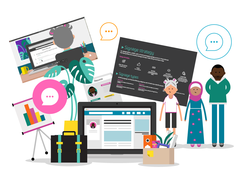
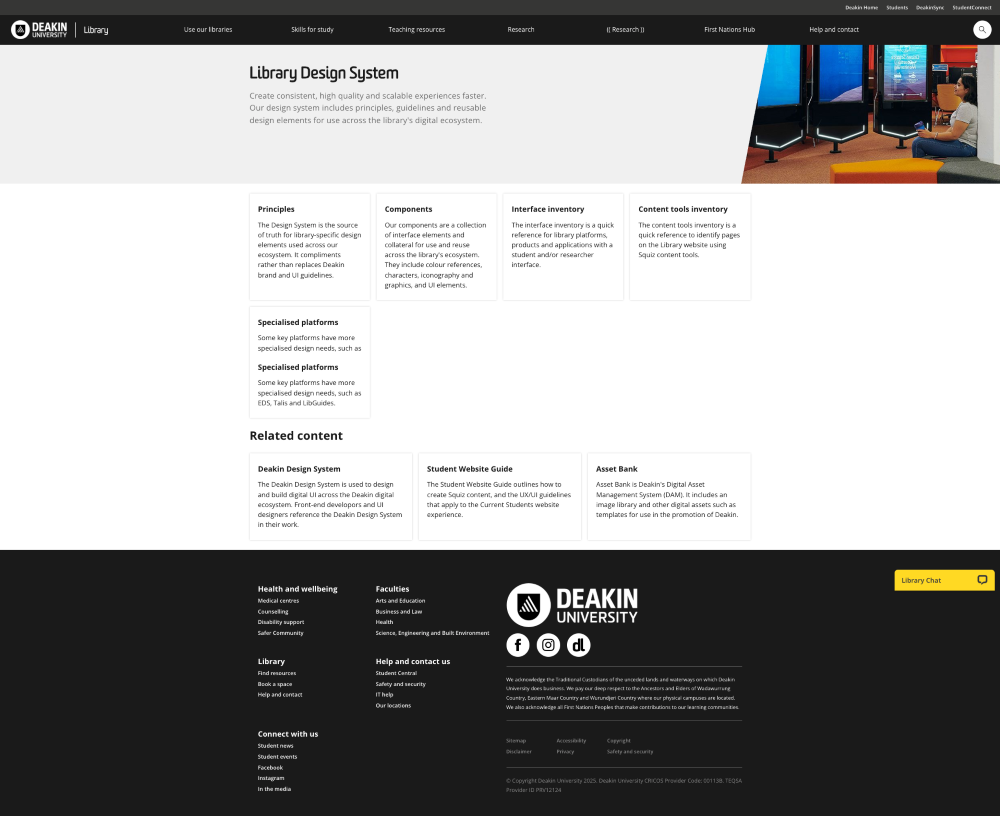
Our solution was to develop the Library Design System (LDS), a website that serves as an authoritative resource for library-specific design elements used across our digital ecosystem (see Figure 1). The LDS references and extends existing university-wide design guidelines, principles, and toolkits to offer targeted, library-focused design direction.
By consolidating this information into a single source of truth, and as a design team agreeing on a design direction, we were able to create a resource that met our expert designers’ and developers’ needs. But we still needed to understand exactly what our general library staff needed when they created their own library content.
In mid-2018, to understand our broader library staff's pain points, needs, and challenges, we interviewed a cross-section of staff. We learned that they were developing materials, including videos, presentations, library guides, course materials, signage, posters, flyers, bookmarks, postcards, and digital displays, and that they wanted a bank of visual components to save time and ensure their designs visually connected and seamlessly integrated into the Deakin ecosystem.
Our solution was to create a components section at the heart of the LDS, which contains visual design assets, templates, and advice to help librarians and library staff without professional design expertise. There are currently nine different component categories, used by staff in various ways. They contain a series of university-branded, accessibility-compliant, copyright-free, library-specific visual assets, including iconography, graphics, characters, scenes, video tail/end frames showing the Deakin logo and library contact details, and library-themed photographs.
To ensure staff use the visual assets correctly we included brand and style guidelines, recommended resources, advice, and training on everything from how to use the University’s logo, to visual design principles (visual hierarchy, scale, balance, and contrast), the video production process, and more.
FIGURE 1 Library Design System website, built in the enterprise content management system Squiz Matrix.
These assets include a bank of over 200 library-specific icons, available in packs that contain three styles (see Figure 2). These icons come in five Deakin-branded colors that meet WCAG accessibility compliance. We have also provided recommended use guidelines.
FIGURE 2 Sample contents of an individual icon pack.
These icons have been embedded across a range of library resources, to help signpost important content, explain difficult concepts in a visual way, and reduce the cognitive load of our users through consistent use.
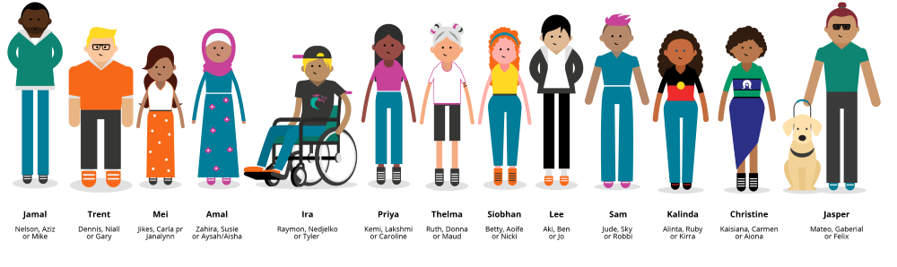
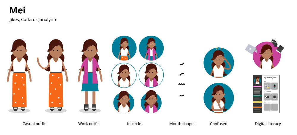
We also designed 11 illustrated characters, each with four names, outfits, accessories, and stories, that can be used in library signage and instructional materials (see Figure 3).
These characters mirror the diversity of our students. To ensure they were designed in a respectful and collaborative way, we consulted with our Deakin equity and inclusion team, our student body, and other specialist university staff, including the library learning design team, during the design process.
FIGURE 3 Eleven casually dressed characters with suggested names.
FIGURE 4 Sample contents of an individual character pack.
Our library staff harness these illustrated characters to communicate complex concepts and tell stories about different people’s experiences. They engender a sense of belonging among our students.
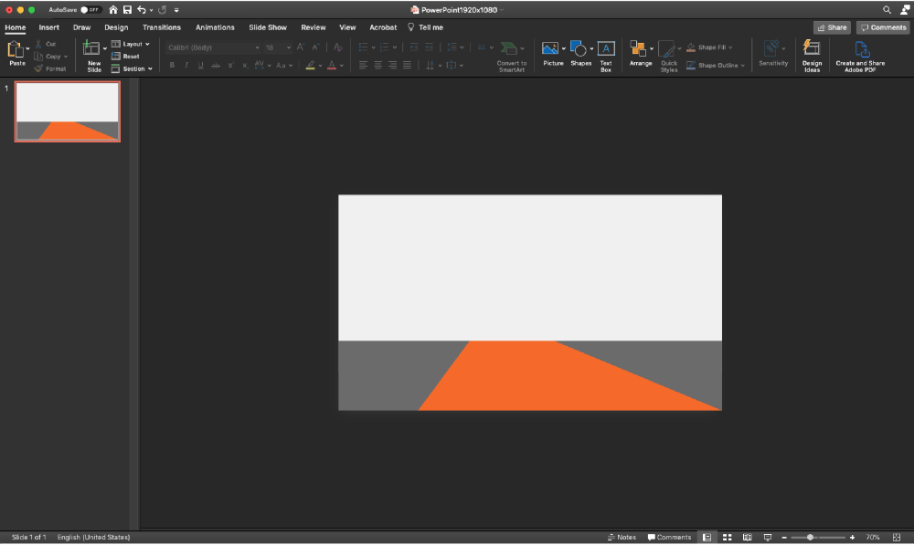
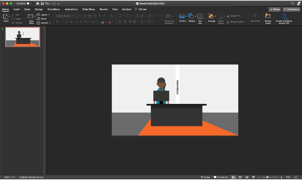
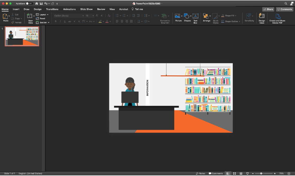
Finally, we’ve designed 16 different graphics packs, each containing PNG files in five sizes, that depict various university settings, such as the different campus libraries, architecture studios, city buildings, courtrooms, hospitals, and lecture spaces. There are also sets for office equipment, research environments, and outdoor elements, like trees and construction sites.
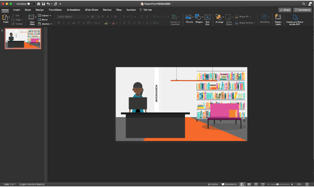
Staff can layer these graphics to create their own scenes in PowerPoint—as illustrated in Figures 5 to 8 below—or in Canva, Adobe products, H5P, or any other design software. They can also use them as standalone assets.
To allow staff to easily create tailored visuals that fit their specific needs, we’ve designed graphics in various dimensions.
This approach makes it easy for staff to build engaging custom visuals for their learning and communications materials while maintaining brand consistency.
FIGURE 5 PowerPoint scene building template, add background image.
FIGURE 6 PowerPoint scene building template, add information desk and character.
FIGURE 7 PowerPoint scene building template, add bookshelf.
FIGURE 8 PowerPoint scene building template, add couch.
Why It Matters
Since its development, the Library Design System has been used by over 80 library staff members. The graphics, icons, characters, and scenes have been used in over 100 library guides, countless presentations, and teaching and learning content, as well as in reports, posters, signage, and videos. Some examples include:
A guide to using genAi that has been recognized by Australia’s Tertiary Education Quality and Standards Agency (TEQSA) as a best practice exemplar (166,952 views in the last 12 months)
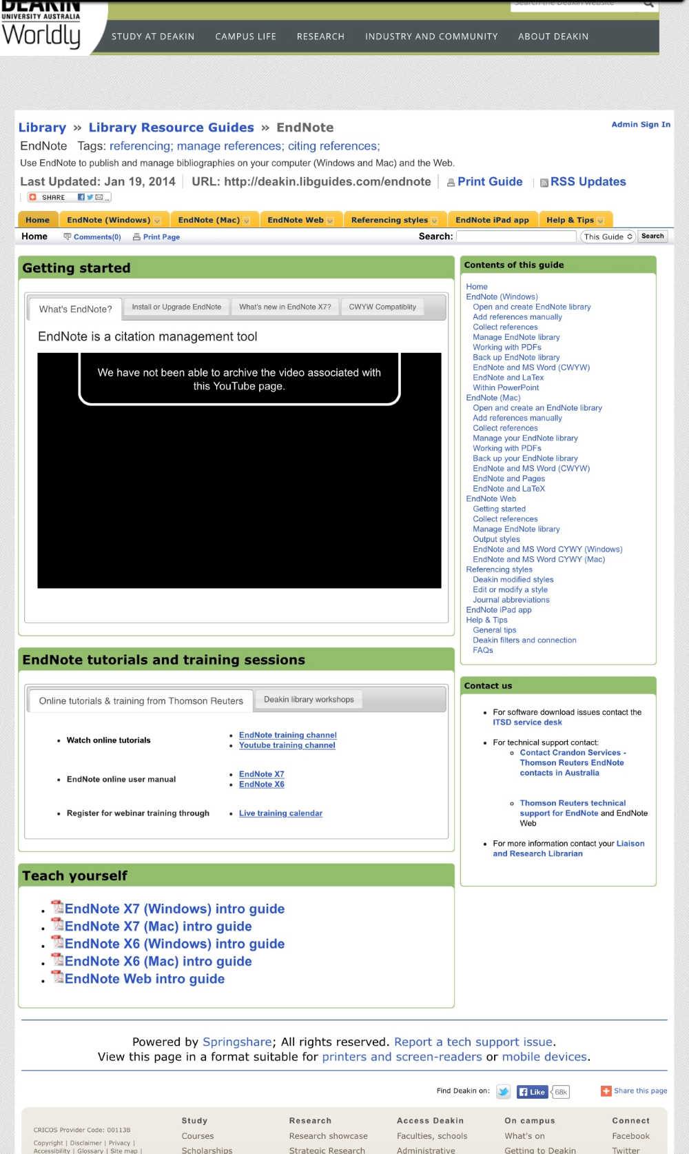
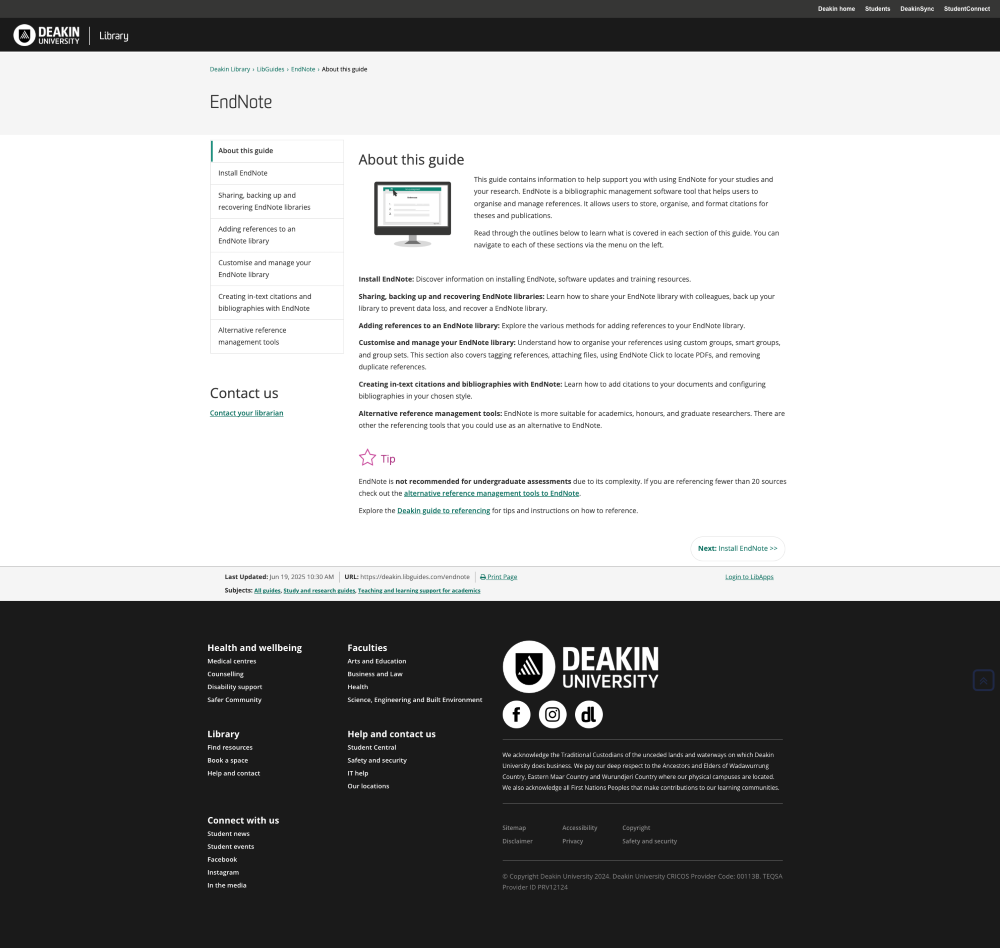
Staff have been able to uplift the content they are creating and bring it into alignment with the university’s visual style guides, creating a better experience for our users. The visuals now reflect the great quality of the content (see, for example, Figures 9 and 10, which compare our Endnote resource guide before LDS and after LDS was developed).
FIGURE 9 Endnote resource guide before Library Design System development, 2014.
FIGURE 10 Current Endnote resource guide, 2025.
I’ve received a lot of positive feedback—both from librarians and general library staff, as well as from staff across Deakin—about the Library Design System. We also spoke to a representative sample of our student cohort to hear their thoughts on the character designs. The response was overwhelmingly positive: 95 percent of students liked the visual style of the characters, 100 percent felt the characters reflected diversity and encouraged inclusion, and 80 percent said the characters would help students feel like they belong. One student summed it up beautifully: “I'm so glad to be in a university that puts energy and effort into making its students feel comfortable and welcome.”
As funding becomes more challenging for institutions and libraries, it can be difficult to justify investing in non-traditional roles like mine. But it’s unfair to expect librarians and general library staff to develop exceptional visual content and experiences without the necessary support.
Excellent visual design matters: it helps the library engage with users, communicate important ideas, and support good teaching. By balancing business needs, subject matter expertise, and good design practices, we’ve been able to create high-quality, consistent, and scalable designs that can be applied across various library platforms and channels, saving staff time and resources and enhancing the experiences of library users. Ultimately, good visual design makes the library better.
10.1146/katina-062625-1
Sarah Fennelly is a visual designer with 17 years of experience, including 12 at Deakin University Library. She believes in the power of design to support learning by making complex content more accessible and engaging. Passionate about user interface/user experience design, she enjoys helping people—especially non-designers—communicate clearly and confidently. Her work includes digital displays, open educational resources (OERs), design systems, animations, and print. Sarah values collaboration with learning designers, developers, accessibility experts, and subject matter specialists. For her, good design starts with listening and refining ideas to create solutions that truly work. She finds the ever-evolving nature of design both inspiring and exciting.
Thank you for your interest in republishing! Anyone is free to use and reuse the article text and illustrations created by Katina for non-commercial purposes under a CC BY-NC license. Please see our full guidelines for more information. Photographs and illustrations are not included in this license. This HTML is pre-formatted to credit both the author and Katina.
This is a required field
Please enter a valid email address
Approval was a Success
Invalid data
An Error Occurred
Approval was partially successful, following selected items could not be processed due to error